6.3. Fitting Data II
In the previous lecture, we did a very simple fit of a straight line to some data, extracting the value of slope of the data.
But how does gnuplot define the “Best” fit?
This goes under a very old branch of mathematics called “Linear Regression” (when fitting linear functions), or “Least Squares*” fitting, or sometimes “Data Modelling”.
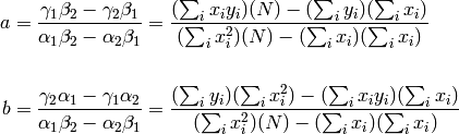
In it’s simplest form, the procedure works like this. We’ll consider a very simple linear fit to three data points.
Suppose your experiment gives you these three data points:
1.0   0.7    # x1, y1
2.0   0.8    # x2, y2
3.0   1.7    # x3, y3
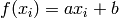
You define a function f(x) = a*x + b which has some parameters that you can change, a and b in this case.
Each different value of a and b gives a different line; three different possible line examples are shown below.
But again, how do you know which line is the best fit (i.e. comes closest to the data)?
For each data point (labeled by i = 1,2,3), we compute the
difference between our guess function
 (at
(at  ) , and the
  value of the real data.

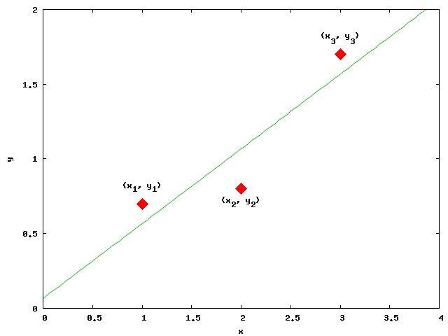
This difference is called the Residual at . The residuals of
each data point are shown as the little vertical lines ( | ) in the
figure above.
Since these can be either positive or negative, we square them to get a positive number irregardless of whether the data is above or below the line.
Then we sum all the squares of residuals.
![R &= \sum_i \left[ y_i - f(x_i) \right]^2 \\
&= \sum_i \left[ y_i - (ax_i + b)\right]^2](../_images/math/398d4722f0c934b90a8b2ef80fbda452d64bfed3.png)
Then: the fit program changes the parameters ( ‘a’ and ‘b’ in our case, but there could be more) to get the lowest sum of the Squares of the Residuals , min{R}, hence the name “Least Squares Fit”.
For those who know calculus, we are really doing is taking the derivative of R with respect to a and b and setting those expressions to zero; this finds where R has a minimum as we vary a and b.
This gives two equations that we have to solve, sumultaneously.
![\frac{dR}{da} = -2\sum_i \left[ y_i - (ax_i + b)\right]x_i &= 0 \\
\frac{dR}{db} = -2\sum_i \left[ y_i - (ax_i + b)\right] &= 0](../_images/math/bec08f6e9f723fe8131b9d04437e7e227df49010.png)
These equations are actually easy to solve (email me if you need help). They are really just a system of two coupled linear equations, which you could use Linear Algebra to solve!
where
It’s easy to solve the equations above for  and
and  :
:
However, gnuplot doesn’t actually solve them!
It just varies a and b and sees how much R changes. If increasing a decreases R, then gnuplot increases a a little more.
Once changing the parameters by a little amount always increases R, fit stops and prints out the resulting parameters:
After 4 iterations the fit converged.
final sum of squares of residuals : 0.106667
rel. change during last iteration : -3.71111e-09

degrees of freedom    (FIT_NDF)                        : 1
rms of residuals      (FIT_STDFIT) = sqrt(WSSR/ndf)    : 0.326599
variance of residuals (reduced chisquare) = WSSR/ndf   : 0.106667

Final set of parameters            Asymptotic Standard Error
=======================            ==========================
 **
a               = 0.5              +/- 0.2309       (46.19%)
b               = 0.0666667        +/- 0.4989       (748.3%)
**
This gives the paramerters of the line that is the “Best” fit to the data, as well as some information about how good the fit is (how big was the sum of the squares of the residuals).
This Best line looks like this. It’s the one that’s closest to the data.
For more information on the Least Squares method can be found here:
- http://mathworld.wolfram.com/LeastSquaresFitting.html
- http://www.mathwords.com/l/least_squares_regression_line.htm
as well as any good math book on statistics.
As you can see from the figure below, we need not limit ourselves to linear functions–you could do the same with almost any function and data.
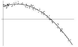
Your job as a scientist is to have insight (usually from theory) as to which function is correct.
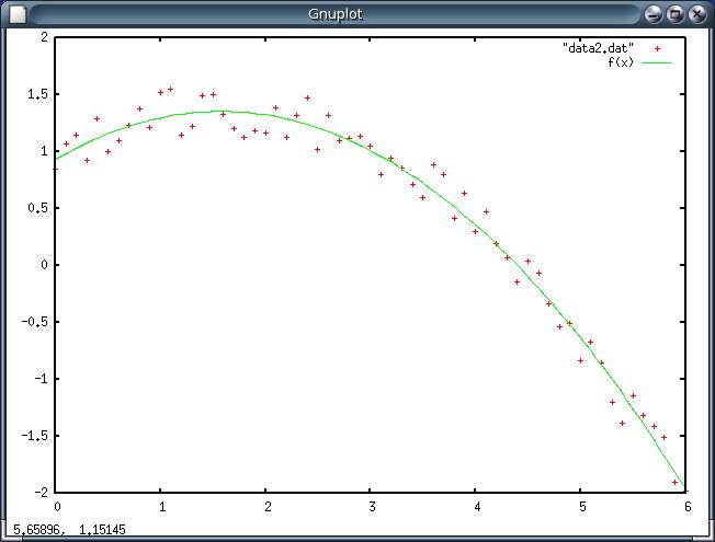
In this case, you want a quadratic function. You would do the following
gnuplot> f(x) = a*x**2 + b*x + c
gnuplot> fit f(x) "data2.dat" via a ,b, c
gnuplot> plot "data2.dat", f(x)
Do you see that we’ve defined a quadratic function: :math”a x^2 + b x + c above? Try this yourself . Here’s the data: data2.dat
Here’s my fit.
Operator Binding or Precedence
Above, when writing about how to enter into gnuplot the fit function for a parabola, I wrote f(x) = a*x**2 + b*x + c
without parentheses. This probably bothers several of you, who would rather see the function written as:
f(x) = a*(x**2) + b*x + c
which is “safer” . As with most computer math operators (like * and /), the “exponent” operator ** acts only on the previous thing.
Clearly
(a*x)**2
is much different than
a*(x**2).
I have been a bit lazy and used the fact that the exponent operator “binds tighter” than the multiplication operator.
When gnuplot reads the line
a*x**2 + b*x + c
it first squares x before anything else, because ** has the highest “operator precedence” or “tightest binding”.
Then it does the multiplications a*(x**2) and b*x
Finally, it does the additions because + has lowest precedence.
But we could also use:
a*(x**2) + b*x + c
6.3.1. Using the “Using” command
A very VERY important feature of gunplot’s plot and fit functions is the using argument. It has MANY uses, some of which we’ll look at below.
6.3.1.1. Plotting data from different columns
Suppose your data file has separate columns of data that are all measured at the same time. You have an example of this in your “YOURNAMEcalpop.dat” file.
Go ahead and find it now.
Before we look at it in gnuplot however, we will have to edit it slightly. It will look something like this (right?):
Year       Total US            Total California
1900       76212168          1485053
1910       92228496          2377549
...
Start emacs and Open YOURNAMEcalpop.dat.
We have to make the first line (or lines) into a comment, ortherwise gnuplot will bail trying to plot the number “Year”.
Remember how to make a line into a comment? If not see here: Plotting Data from a File. (Simply put a # at the beginning of the line. )
Now our file looks like this:
#Year       Total US            Total California
1900       76212168          1485053
1910       92228496          2377549
...
We can do a normal plot:
plot "calpop.dat"`
which plots column 1 and 2 on the x and y axes. However look at what this command does
gnuplot> plot "calpop.dat", "calpop.dat" using 1:3

While the first plot is the normal default one–columns 1:2 on x : y , the second part, calpop.dat” using 1:3, plots the data in calpop.dat again, but this time using columns 1 and 3.
You can simplify this with the abreviated version:
gnuplot> plot "calpop.dat", "" u 1:3
The empty “” means use the same datafile as before (with older versions of gnuplot you will have to supply the datafile name again), and u is short for using.
Also, since the Key is in the way of the data in the upper right, let’s move it, and give the key items titles other than the default names for the plot command.
gnuplot> set key box left
gnuplot> plot "calpop.dat" title "US Population", "" u 1:3 title "CA Population" pointtype 7
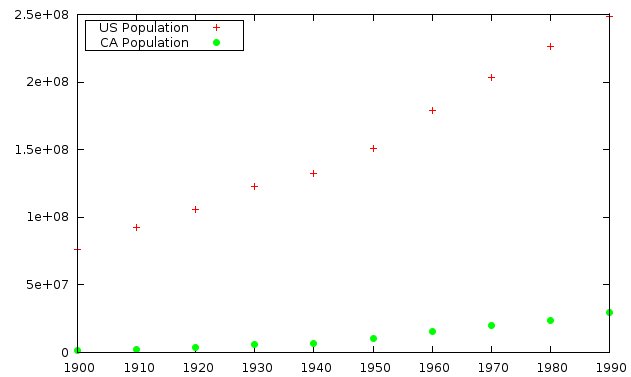
This looks very nice. Notice that we:
- moved the Key and put it in a box, with the single line: set key box left
- added titles to the key items with title “string”. The title character string must be enclosed in quotes.
- changed the point type used for displaying the data by specifying pointtype 7
This long command to gnuplot can be considerably simplified by abreviating title and pointtype to
gnuplot> plot "calpop.dat" t "US Population", "" u 1:3 t "CA Population" pt 7
You can see the different `pointtype`s, and some other info, by typing
gnuplot> test
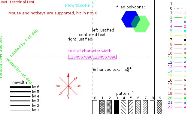
The pointtypes (and linetypes) are shown on the right side).
Of course you could do more if you had more columns, such as
plot “datafile” u 1:4, “” u 1:3, “” u 3:2
etc. Notice that the last instance, u 3:2, plots the 3rd column as the x values and 2nd column as y values of the points.
Very nice, huh? But now–Check this out!
You can modify the data on the fly with using!
Try these examples:
gnuplot> plot "calpop.dat", "" u 1:(10*$3)
gnuplot> plot "calpop.dat" u 1:(1.0/$2)
gnuplot> plot "calpop.dat" u 1:($3/$2)
In the above examples we did
u 1:(10*$3)  -> plots 10 times the -value- in column 3
u 1:(1.0/$2) -> plots 1.0/y for column 2 values
u 1:($2/$3)  -> plots the ratio of the values in columns 3 and 2
Here’s the syntax for modifying data with using:
Simple i.e. just plot different columns:
- The using command takes the form u 1:4 to plot columns 1=x and 4=y, for example. No parentheses needed to just rearrange the columns used for x and y.
If you want to refer to the value in a particular column, so that you can multiply, divide, or act with other math functions on it, etc.
Manipulating column values in the plot:
- instead of a column number [example u 1:4], you must enclose the column placeholder in ()s.
- inside the ()s, you must refer to value of a datum in column n as $n. Like this: u 1:($4)
- then, you can treat $n as the value of the datum for that point.
Here’s an example. Our Rutherford  -particle scattering experiment
produces the following data:
-particle scattering experiment
produces the following data:
file: ruth.dat:

#theta  flux
-30     27.6
-25     65.4
-20     195.2
-15     762.4
-10     4740.8
-5      14392.6
0       9139.8
5       1957.6
10      361.6
15      113.6
20      35.8
25      23.2
30      12.2
and the following gnuplot commands create this plot:
gnuplot> set xlabel "angle theta (degrees)"
gnuplot> set ylabel "Counts per 1000 sec"
gnuplot> plot "ruth.dat" t "Run 1" pt 5
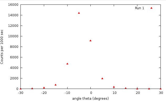
According to theory, these data should
follow a curve that looks like this, where A and  are constants (to be solved for):
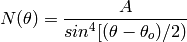
It turns out that the fit procedure has a hard time with this because of the singularity
when  is zero.
This is a common issue for curve fitting algorithms; if the fit function has a singularity, they often fail.
However, if we were to plot the inverse of our data:  , our fit function to
those data would be
, our fit function to
those data would be
![\frac{1}{N}(\theta) = \frac{1}{A} sin^4[(\theta-\theta_o)]/2)](../_images/math/10d115e3e9a0a7fe9751b746bd347f2d46f32e41.png)
This function simply goes to zero as  , instead of blowing up.
So the fit command is stable. It’s really simple to plot the inverse of our data from the same
file:
, instead of blowing up.
So the fit command is stable. It’s really simple to plot the inverse of our data from the same
file:
gnuplot> plot "ruth.dat" **u (pi*$1/180):(1.0/$2)** pt 5
Notice that I also converted the angle (in column 1) to radians.
Now it’s easy to fit this data:
gnuplot> fit f(x) "ruth.dat" u (pi*$1/180):(1.0/$2) via a,x0
...
After 12 iterations the fit converged.
final sum of squares of residuals : 5.97834e-05
rel. change during last iteration : -4.08902e-07

degrees of freedom    (FIT_NDF)                        : 11
rms of residuals      (FIT_STDFIT) = sqrt(WSSR/ndf)    : 0.00233128
variance of residuals (reduced chisquare) = WSSR/ndf   : 5.43486e-06

Final set of parameters            Asymptotic Standard Error
=======================            ==========================

a               = 12.394           +/- 0.3675       (2.965%)
x0              = -0.0577061       +/- 0.003981     (6.899%)
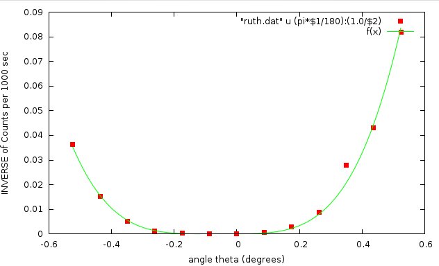
Shazzam!
6.3.1.2. Mathematical Manipulations of Data with Using
With the using command, you can do simple or complicated mathematical transformations of your data when you plot it.
A very simple example is this. Suppose you you have these two data sets:
If you plot them,
gnuplot> plot "h1.dat", "h2.dat"
they look like this:
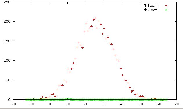
The h1 data shows some interesting structure: clearly there is something happening at around x = 25, but it’s pretty hard to see what’s going on with h2. Have a look at the data files by scrolling throuh them with less:
less h1.dat
...
1.130134e+01    70
1.230134e+01    79
1.330134e+01    93
1.430134e+01    104
1.530134e+01    134
1.630134e+01    146
1.730134e+01    139
...
and
less h2.dat
...
1.275000e+01 0.426
1.325000e+01 0.346
1.375000e+01 0.324
1.425000e+01 0.292
1.475000e+01 0.252
1.525000e+01 0.198
...
Ah. Now we see what’s going on. Where h1.dat has values around ~100, h2.dat‘s values are around ~01. Perhaps we are looking at the energy spectra from two different sources, one much more intense than the other.
Let’s adjust this with the using command and scale the h2 data.
Plot the data this time with:
gnuplot> plot "h1.dat", "h2.dat" u 1:(10*$2)
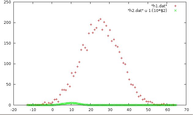
Notice the syntax to the using (u) command: u 1:(10*$2). This means “use the column 1 values as they are for x, then take the value of the column 2 entry ($2), multiply it by 10, and use it for the y value (10*$2) of the point to be plotted.
Now we see something emerging–a little bump at ~x = 10.
We can blow this up even more by increasing our “scale factor” in the using command. Try:
gnuplot> plot "h1.dat", "h2.dat" u 1:(100*$2)
gnuplot> plot "h1.dat", "h2.dat" u 1:(400*$2)
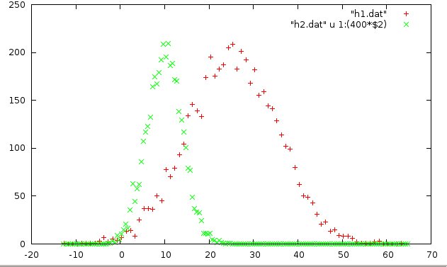
Now we can see something important. The h1 data has a peak around ~25, whereas the h2 data peaks around ~10. This is a simple use of the using feature.
While you need to know what you are doing, know that you can use any of the built-in math functions with using. In fact you can build quite complicated functions of your own and apply them.
Here’s a very simple example:
Suppose your file looked like this:
# x   y

  1   1
  2   10
  3   100
  4   1000
the using command
u 1:(2*log10($2)+1)`
would plot these data as if they were
# x             new y

  1   2*0+1    =  1
  2   2*1+1    =  3
  3   2*2+1    =  5
6.3.1.3. Using and If/Then
Here is another of my favorite handy using examples. Make sure you understand what it does.
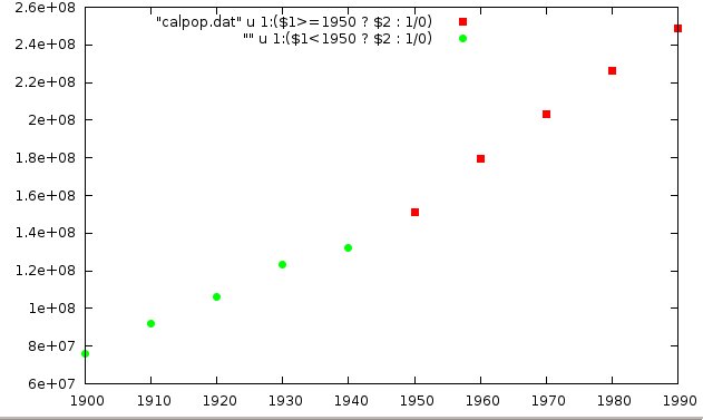
plot "calpop.dat" u 1:($1>=1950 ? $2 : 1/0) pt 5, "" u 1:($1<1950 ? $2 : 1/0) pt 7
This uses the fact that 1/0, division by zero, evaluates to undefined , so gnuplot ignores that point.
The IF/THEN (actually called the “ternary”) operator works like this:
y = Conditional ? Value if True : Value if False
Ususally, when we write y = x we are set y to the value of x. So if the value of x = 5, then after the statement y = x, the value of y is now 5.
In the ternary operation, in order to determine the value that y should be set to, the Conditional statement is evaluated. A Conditional statement is either True or False, like x > 0 or x <= 10. If the Conditional is True then the value used for y is the first value–the one between the ? and the :. If the Conditional is False, then the second value is used, the one after the :.
In the example above,
u 1:($1>=1950 ? $2 : 1/0)
the first part of the using operator u 1:, takes the first column of the data file (Year) for the x value of the plotted point, as per normal. However the second part ($1>=1950 ? $2 : 1/0 runs the Conditional first: $1>=1950, and checks if the year ($1 is the value in the 1st-column) is less than 1950; if YES it is, the Conditional returns True and the “normal” value as listed in the file: $2 meaning the value from column 2 is used for the y coordinate of the point.
If the Conditional is NOT satisfied (evaluates as False), then the y coordinate is set to 1/0, which is undefined. So gnuplot ignores this point and does not plot it. The result of the above using expression is that only points whose year is greater or equal to 1950 are plotted.
To make the plot shown above, with red squares and green circles, plotted two versions of the data, each with its own conditional.
For the first data set in the plot, the u command asks if the x value (the year) is greater or equal to 1950. If so, it is plotted as is, with pointtype (pt) 7.
In the next data set in the plot, if x (the year) is less than 1950, the u command returns that point’s normal y value, and it is plotted (this time with pt 7). In the second case, points for years > 1950 are not plotted.
This is a handy way to suppress plotting or fitting of some part of your data.
More fun with the Ternary
Finally, one last example. This one goes out to all of you who have to take Digital Signal Processing.
First, let me introduce a couple interesting math functions.
floor(x) returns the largest integer less than x.

 Thus: floor(4.73) = 4
       floor(9.99999) = 9
       floor(pi) = 3
       etc.
and the mod operation, for which we use the percent symbol: %
For two integers a and b:

a % b returns the remainder of integer division.

Thus: 7%3 = 1
      12%6 = 0
      24%5 = 4
       etc.
A convenient Conditional to check if an integer a is EVEN, is
a%2 == 0
If this is True, then a must be even (divisible by 2 with no remainder). If it’s False, then the remainder is 1, and the number is ODD.
The mod operation only works for integers however, but you can combine the floor operation to extract the integer part of a number, then use that in a mod expression.
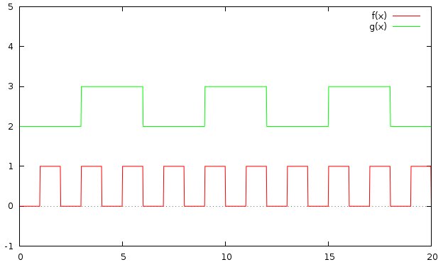
Now consider this graph. I have set samples 1000 to get a finer plot with 1000 sample points, rather than the default 100 points. That way, my “edges” are more vertical. If you set samples 100 back to the default, you’ll see what I mean.
gnuplot> f(x) =  floor(x)%2 == 0 ? 0 : 1
gnuplot> g(x) =  floor(x/3)%2 == 0 ? 2: 3
gnuplot> set zeroaxis
gnuplot> set samples 1000
gnuplot> plot [0:20][-1:5]  f(x), g(x)