5.1. Scientific Visualization
When doing science, you will often need to “look at some data”.
In fact, I almost always have a quick “Exploratory” look at whatever data I have for a project or experiment, so that I can make sure that everything is making sense. If the temperature of your sample should go up as you increase the magnetic field, then a quick look at your temperature v. magnetic field data will tell you if you have a loose wire, before you spend a lot of time doing a complete experimental run.
Usually, you will be comparing recorded data with a theoretical prediction from a model in mathematical form.
For this you will need software to do scientific visualization. You are certainly already familiar with the simplest form of data visualization, i.e. plotting or graphing x and y values on a Cartesian grid.
Let’s examine this idea of scientific visualization. Here is a definition taken from a tutorial on the website of the Georgia Tech Scientific Visualization Laboratory an entire institute set up to help scientists and engineers with visualization at GT.
*Scientific visualization, sometimes referred to in shorthand as*
**SciVis**, *is the representation of data graphically as a means of
gaining understanding and insight into the data. It is sometimes
referred to as visual data analysis. This allows the researcher to
gain insight into the system that is studied in ways previously
impossible.*

*It is important to differentiate between scientific visualization and
presentation graphics. Presentation graphics is primarily concerned
with the communication of information and results in ways that are
easily understood. In scientific visualization, we seek to understand
the data. However, often the two methods are intertwined.
Thus scientific visualization is a means of using graphical techniques
to allow the incredibly powerful, massively parallel processing, high
performance, neuro-optical wetware (your eyes and your brain), to look
for patterns in the data.*
I would also argue that once you have understood your data, the very next step is to present your results to others! To do that, you take the graphics of your visualization studies, clean them up, add helpful guides and text, and make presentation graphics for publication or oral presentations. So, the two are very closely related.
Shortly, we will get a tool which will serve us for both aspects.
5.1.1. Some Examples
First however, follow the link below to look at a few very impressive visualizations of some interesting data from the Wall Street Journal’s Classroom page.
Look at these graphs

prepared by Karl Hartig, for the from the Wall Street Journal Classroom Edition.
These are best viewed in their PDF versions (because you can zoom in deeply), reached by clicking on the PDF icon below the image on each page.
In particular, be sure to look at
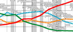
- The Computer Power chart. This one documents the exponential rise in the processing power of computers in the last decade (the so called, Moore’s Law). However, I find many of these presentations very thought provoking.
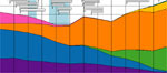
- The 3-D US Population graph shows the age people living in the last century, and how surges, like the Baby Boomers born after WWII, move forward in time so that the overall age distribution of the population seems to have “ridges” along diagonal lines.
- The 3-D plot of imigration shows that the current imigration wave is not unlike the one which occured in the 1800’s.
- Energy Production/Flow is quite important as well. Understanding how to make this more efficient is going to become an essential part of 21st century engineering-physics.
One last example. Have a look at www.gapminder.org/world.
It plots average Life Expectancy versus average Income per Capita, for each country, for each year since 1800. In addition the Population of each country is also shown by the size of the marker. You can run the graph as a movie, letting time (the fourth dimension) run from 1800 to 2013.

Run the movie, by clicking Play .
Notice the worldwide downward vertical bumps in Life Expectancy in many countries during World War I from 1914-1918, and from World War II from 1939-1945.
This data visualization tells an incredible story. The tool that presents it has been well crafted, allowing you to choose several different quantities to plot so that you can explore many relationships.
Data visualization is a fundamental aspect of doing science.
5.1.2. SciVis Apps
There are many software applications for doing SciVis. A non-authoritative list is here. Have a look, and scroll to the bottom of the page, to the See Also section.
Many of these are very powerful, and many are very expensive. Your computer may already have a software program to graph data (Excel, for example, and other spreadsheets used in business computing will make simple graphs of data).
Also, you may have had experience with other scientific analysis programs, such as Matlab, Maple, and others. These are powerful and very good applications.
If you have experience with these, it will come in useful, since the more applications you are familiar with, the more versitile you will be as a scientist or engineer. Furthermore, your career is likely to involve several employers as you begin to build expertise in you area. Different employers will have different resources; Lawrence Livermore National Laboratory, will have many different software packages, and your boss may not blink if you ask to buy Matlab at $10,000 because that is what you are familiar with.
My philosophy in this course is to, as often as possible, provide you with free tools, which you can “take with you” to your next position, and the one after that.
Linux provides a platform for many of these tools, and Gnuplot is one of the easiest to use.
Another popular choice is Matplotlib, which is part of the Python programming language. In a follow-up course to this one, I plan to include a couple chapters on Matplotlib and other Python Scientific Visualization tools like Mayavi. For now, though, we will use `Gnuplot >http://matplotlib.org>`_.
5.1.3. Gnuplot
Note
“I can’t believe this is free!!!“—–Ben Rosenkrantz, B.S. Physics 2006
That pretty much sums it up. Gnuplot is an amazingly powerful plotting and data fitting program, capable of making 2 and 3-D plots such as y = f(x), and z = f(x,y). I use it for most of the data visualization in my research.
5.1.3.1. Getting Started with Gnuplot
First, let’s keep our gnuplot exercises in a separate directory.
Open an shell terminal, and make a subdirectory below your home dir called:
gp (you can give it a different name if you like).
Now cd to gp .
We’ll save Gnuplot files and data here.
We’ll use Gnuplot to display three primary types of plots, often on the same graph for comparison. These are:
- Builtin Mathematical Functions
- Numerical Data from a File
- User Defined Functions
We will also do
- data modelling and statistics
- publication/presentation graphics
Now at the shell prompt, type
gnuplot
This will start the gnuplot program and you should see something like this on your screen:
     G N U P L O T
     Version 4.6 patchlevel 3    last modified 2013-04-12
     Build System: Linux x86_64

     Copyright (C) 1986-1993, 1998, 2004, 2007-2013
     Thomas Williams, Colin Kelley and many others

     gnuplot home:     http://www.gnuplot.info
     faq, bugs, etc:   type "help FAQ"
     immediate help:   type "help"  (plot window: hit 'h')

Terminal type set to 'wxt'
gnuplot>
This last line:
gnuplot>
is the Gnuplot prompt which is where you will type gnuplot commands.
5.1.3.1.1. Step One: Builtin Math Functions
In the examples below, be sure to type things exactly as they appear.
Any quotes ( “) and commas ( ,), etc. are important!
At the gnuplot> prompt, type
plot x
and hit Enter.
You should see a graph window with a diagonal red line. This is a plot of the function f(x) = x.
Gnuplot’s default plotting range for x is [-10:10] (the range between x = -10 and x = +10).
You just plotted your first function.
Next, let’s add a quadratic function: 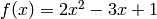
To do this, hit the UP arrow to bring back the previously entered command and now add the following, then press Enter.
plot x, 2*x**2 - 3*x + 1
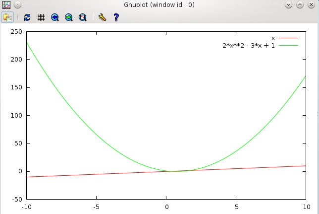
Does your plot look the same? (There should be a line and a parabola).
Notice how we entered

as
2*x**2 - 3*x + 1.
We must explicitly tell gnuplot about multiplication with the *
operator.
For the quadratic term,  , we use the notation
 x**2, where the
“double star” notation: ** represents exponentiation.
For example, we could do x**0.5 for  (the square root of x),
however gnuplot has a builtin function:
(the square root of x),
however gnuplot has a builtin function: sqrt(x) for this.
Also, we have two functions plotted, f(x) = x, a linear function  , and
, a quadratic function.
, and
, a quadratic function.
They are both plotted on the same graph with one plot command, separating the two
functions x and 2*x**2 - 3*x + 1 with a comma ,
plot x, 2*x**2 - 3*x + 1
We can plot several more functions on this same graph, we simply put commas between each function to be plotted.
Note
When plotting 2-dimensional plots, the independent variable is (almost) always x.
I say “almost” because we can do parametric plots (a more advanced concept) where the independent variable is t.
But until we get there, remember: Gnuplot functions are always
functions of x. sin(x/pi), exp(-x**2/4), x**3 - x, etc.
5.1.3.1.2. Step 2: Plot Range
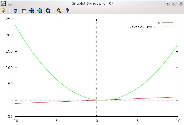
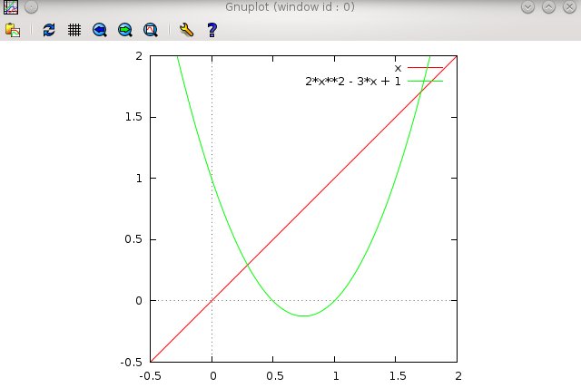
Let’s make the plot a bit easier to read. At the prompt, type:
set zeroaxis
Then use the UP arrow to recall your last plot command. Press
Enter.
Now you should have dotted lines along the x = 0 and y = 0 axes. It’s a little easier to see where your functions are located relative to the origin with these.
Now, let’s zoom in a bit. The interesting area of the graph is where the two functions intersect. Let’s narrow the plot range.
Using the UP arrow, recall your previous plot command.
Now use the LEFT arrow to move the cursor to just after the plot command, and insert a range specifier [-0.5:2] as shown below:
plot [-0.5:2] x, 2*x**2 - 3*x + 1
Notice what this does (press Enter to execute the plot command
if you haven’t already). The graph should be restricted to the area between x
>= -0.5 and x <= 2.0 .
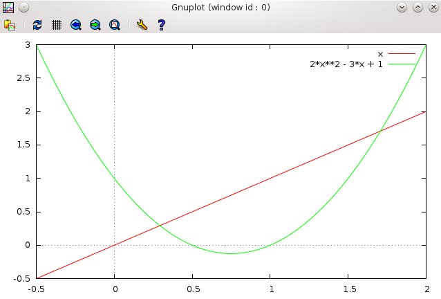
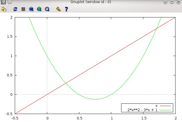
You can also limit the y range by adding a second range specifier for the y axis.
plot [-0.5:2][-0.5:2] x, 2*x**2 - 3*x + 1
which also limits the y range of the plot to lie between particular values.
The format for the range is
[Xmin :Xmax][Ymin :Ymax]
One can allow the x range to be free while specifying the y range with
[:][Ymin :Ymax]
and similarly
[Xmin :Xmax][:] to leave the y range free.
This however is equivalent to simply [Xmin :Xmax] by itself
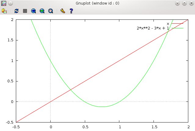
Notice that even though the x-range and y-range are the same [-0.5:2],
the plot is still rectangular. This is the default for this system.
In order to get a Square plot, you type this:
set size square (RETURN)
then type replot (RETURN).
Replot always reproduces the last plot—it’s the same as using the UP arrow key to recall the last plot command typed, and hitting RETURN.
set size square will produce a plot that looks like this.
To go back to your original aspect ratio, type:
set nosquare
then RETURN, then replot (then RETURN).
5.1.3.1.3. Step 3: Label the Graph
Still the graph needs more. Let’s notice some things.
There is a Key telling us which plotted lines correspond to which function.
The default Key is to draw short examples of the lines used and copy the function that you typed to plot beside the associated line.
Notice that the key is run over by the plot lines. You can move the key to another place by typing
set key bottom right box
replot
The replot command re-draws the last plot command.
Notice where the Key is now, in a more conveniently viewable location, and it has a nice box around it.
You can get rid of the box if you don’t like it by typing
set key nobox
replot
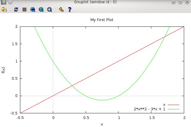
A graph also needs labels! If your high school teacher did not hammer this into you, let me do so. We can add these with
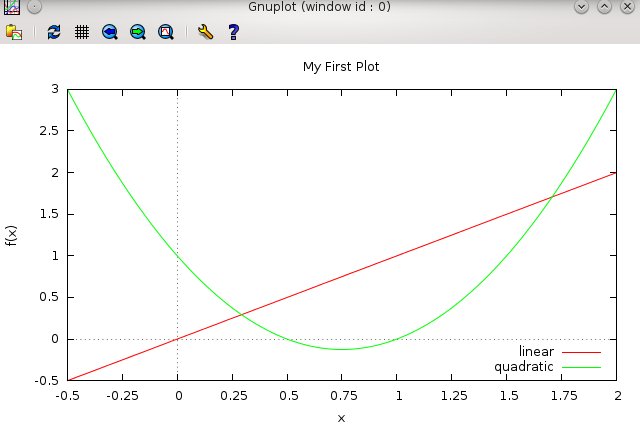
set xlabel "x"
set ylabel "f(x)"
set title "My First Plot"
replot
This should label the x and y axes, and put a title above the the graph, as shown above. Verify that it does so.
Also, notice that the words you want to appear in the labels must be enclosed in “”s.
Words such as these in labels, etc. are called strings ( short for a string of characters), and all “strings” must be enclosed in “”s. You can even clean up the Key a bit, by giving labels to the lines. Look at the Key as it is now in your plot.
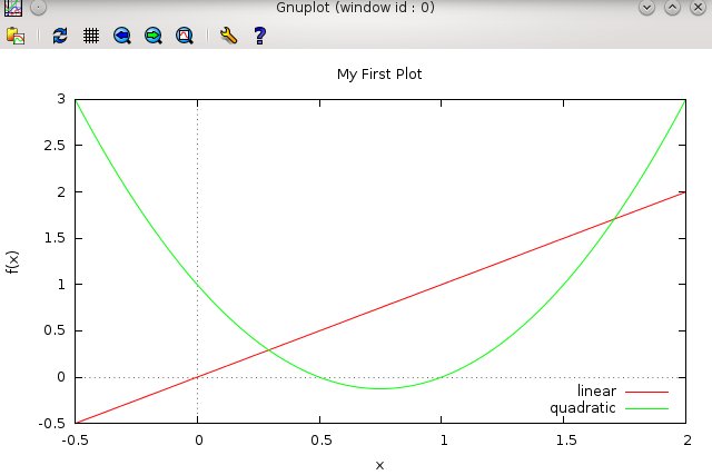
Call back your previous plot command with the UP arrow, and add the following title option to each function
plot [-0.5:2][-0.5:3] x title "linear", 2*x**2 - 3*x + 1 title "quadratic"
Do you see what that did to the Key?
You can learn more about the possible settings for the Key by typing
help set key
This will display Help contents on the options and usage of the set
key command.
gnuplot> help set key
The `set key` command enables a key (or legend) describing plots on a plot.
The contents of the key, i.e., the names given to each plotted data set and
function and samples of the lines and/or symbols used to represent them, are
determined by the `title` and `with` options of the {`s`}`plot` command.
Please see `plot title` and `plot with` for more information.
Syntax:
set key {on|off} {default}
{{inside | outside} | {lmargin | rmargin | tmargin | bmargin}
| {at <position>}} {left | right | center} {top | bottom | center}
{vertical | horizontal} {Left | Right}
{{no}opaque}
{{no}reverse} {{no}invert}
{samplen <sample_length>} {spacing <vertical_spacing>}
{width <width_increment>}
{height <height_increment>}
{{no}autotitle {columnheader}}
{title "<text>"} {{no}enhanced}
{font "<face>,<size>"} {textcolor <colorspec>}
{{no}box { {linestyle | ls <line_style>}
Press return for more:
Keep hitting the RETURN until you get the gnuplot> prompt back.
One more thing. Suppose we want a bit finer resolution on the x axis than small tics in steps of 0.5.
Suppose we wanted them every 0.25 instead. We can accomplish this by doing
set xtics 0.25
How do you think you would adjust the y tics?
At this point, your plot should look like this.
5.1.3.1.4. Summary
Let’s summarize what we’ve done so far. If you need to, go back though the above exercise and make sure you know how to do each of these things.
- Gnuplot plots functions of x. In other words, our functions are
made from polynomials or builtin functions in which an x must appear. To see what I mean: Try plot y**2 , then try plot x**2
- We plotted two different functions on the same graph . We could
easily add more by separating each function by a comma.
- We learned the simplest mathematical operators: * for multiply,
and the exponent operator **, as well as + and -. Division is done with the forward slash: / as in 1/x**2 for
- We learned how to adjust the range of the plot, and add a zeroaxis .
- We learned how to move the Key and change its labels.
- We learned a little about the help command.
- We learned how to set labels for axes and give a title to the graph.
- We changed the resolution of the axes tics with set xtics 0.25 (we could set the y resolution with set ytics 0.1 for example).