5.4. Plotting Data from a File
Now we are getting down to it.
What we have done so is good for learning mathematics, i.e. plotting beautiful functions and seeing what they look like. We even learned to solve an equation “Graphically”.
But as scientists we are often trying to learn something about physics from an experiment that we have done. In other words, we have some data and we what to understand what theoretical model or mathematical relationship is indicated by this data. We can often tell that by just looking at a plot of the data, or in fancier language: visualizing the data. That’s what we’ll do now.
First, we need some data.
Open Emacs and enter the following data. You should be able to cut and paste it from your browser window) using the Edit->Copy/Paste tab in the window frame.
It is important that you have columns of ASCII (or text) numbers with “white space” in between them.
“White space” means either a single or more SPACEs (as when you hit the space bar), or a TAB.
0.0 0.24
0.5 0.66
1.0 1.56
1.5 2.05
2.0 2.80
2.5 1.74
3.0 2.54
3.5 3.36
4.0 4.61
4.5 4.44
5.0 5.61
5.5 4.68
6.0 6.72
6.5 5.97
7.0 7.07
7.5 8.38
8.0 7.44
8.5 9.34
9.0 8.12
9.5 9.97
10.0 10.54
Cd to your gp/ dir and save this file as data1.dat.
5.4.1. Plotting your first data file
Now that you have some data (and have ” **cd**ed” to the place where gnuplot can find it)
start gnuplot.
Type:
gnuplot> plot "data1.dat"
Be sure to include the ” ” s.
You need to do this anytime you refer to a “file” or “folder” on your disk, such as a data file, as I have shown in this sentence.
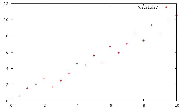
Your plot should look like this:

5.4.2. Plotting Data, Step 2
By this point you show have a plot of some little red +’s representing the data shown above and saved in data1.dat. Let’s play around with this plot a bit.
One of the first things I notice is that the + in the uppermost right corner is not one of the data point in the file! That’s because it is the plot symbol in the key, which in this case, is confusing since it is near other data points.
There are several ways to change this. The simplest is to just move the key:
gnuplot> set key left
gnuplot> plot "data1.dat"
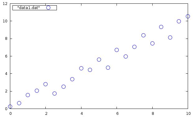
Ah. Much better. You could also out a box around the key; remember how? (see Step Three: Label the Graph:).
Those points are a little small. Let’s change them. This time do the plot with the “with” option:
gnuplot> plot "data1.dat" with points pointtype 6 pointsize 2 linecolor 3

Now we have larger blue circles for data points! Nice. Also, you can abreviate that long line, as you can with most gnuplot command options and variables, by typing:
gnuplot> plot "data1.dat" w p pt 6 ps 2 lc 3
Isn’t that a whole lot easier? Try changing the ” pointtype (pt), the ” pointsize” (ps), and ” linecolor” (lc), and see how your plot changes. You can see the various line/point types and colors by typing test. This will send a test pattern to the screen and show the things available to your screen.
gnuplot> test
To see the options available to the with command, type help plot with at the gnuplot> prompt. You’ll have to hit [SPACEBAR] to page through the help pages and get back your gnuplot> prompt.
5.4.2.1. Summary
So far we have learned the following:
- What is Scientific Visualization.
- How to plot a few mathematical functions (or two, or three, of them...)
- How to customize the plot with **labels, a title, x and y plot ranges, xtics*, etc.
- How to solve an equation graphically
- How to surface plot functions f(x,y) of x and y in 3-dimensions, using splot.
- How to customize plots (move/modify the Key , set isosamples and set hidden3d)
- How to turn on contour plotting.
- How to Plot data from a file.
- How to customize the point size, shape, and color
You’ve learned a fair amount already!
